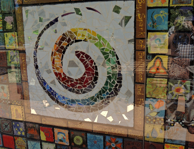
7 Elements of Design and Rule of Thirds

Bob Fanning has provided the following info on how to take great photos using the 7 Elements of Design and the Rule of Thirds.

Each week in June will feature 2 Elements of Design to be incorporated in photos submitted by GHTC members. A description and example of the elements can be found below.

Design elements are the basic units of any visual design which form its structure and convey visual messages. The elements of design are line, shape, form, space, texture, tone (or value) and color, "These elements are the materials from which all designs are built."  


Element 1 - Line

LINE Line definition

Line is an element of art defined by a point moving in space. Lines can be vertical, horizontal, diagonal or curved. They can be any width or texture. And can be continuous, implied, or broken. On top of that, there are different types of line, aside from the ones previously mentioned. For example, you could have a line that is horizontal and zigzagged or a line that is vertical and zigzagged. Different lines create different moods, it all depends on what mood you are using a line to create.

Similarly stars in a constellation connected via imaginary lines are a natural example of using lines in a composition.

Lines are more than just dividers -- the right lines can convey movement and emotion, tying together your composition and making it looked polished and professional.


Element 2 - Shape

Shape

A shape is defined as a two dimensional area that stands out from the space next to or around it due to a defined or implied boundary, or because of differences of value, color, or texture.

For example, a square that is drawn on a piece of paper is considered a shape. It is created with a series of lines which serve as a boundary that shapes the square and separates it from the space around it that is not part of the square.

Types of shapes

Geometric shapes or mechanical shapes are shapes that can be drawn using a ruler or compass, such as squares, circles, triangles, ellipses, parallelograms, stars, and so on.

Organic shapes are irregular shapes that are often complex and resemble shapes that are found in nature. Organic shapes can be drawn by hand, which is why they are sometimes subjective and only exist in the imagination of the artist.

Curvilinear shapes are composed of curved lines and smooth edges. They give off a more natural feeling to the shape. In contrast, rectilinear shapes are composed of sharp edges and right angles, and give off a sense of order in the composition. They look more human-made, structured, and artificial. Artists can choose to create a composition that revolves mainly around one of these styles of shape, or they can choose to combine both.

Shapes: they're not just for preschoolers! A shape can be loosely explained as anything defined by boundaries. There are two categories of shapes to consider:

Geometric shapes, which are defined by perfect, uniform proportions (such as a circle, square, triangle), and organic shapes, which have less well-defined edges, free-flowing proportions, and essentially no rules (such as wiggly, blob-like things that don't fit into any real category). 


When working on a design, consider both the shapes you're deliberately incorporating (the positive shapes), and the shapes naturally formed around those shapes (the negative shapes).

Perhaps the most famous example illustrating the distinction of positive and negative shapes is Rubin's vase. Developed in 1915 Danish psychologist Edgar Rubin, this now-ubiquitous optical illusion shows two completely different images when the negative shapes are viewed vs. when the positive shapes are viewed.

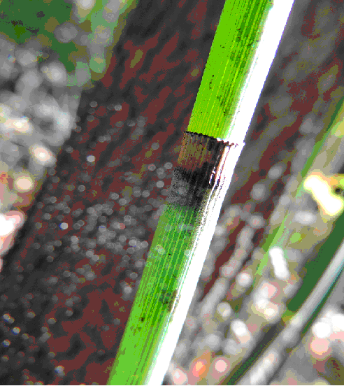
Element 4 Space

Space

 Here's a quick quiz: empty space in a photograph is a) good b) bad. You're right, it was a trick question. The answer is sometimes a, sometimes b, depending on your subject and scene. But the reason I asked you that question is because a common mistake among hobby photographers is in neglecting empty space altogether, all the time. The truth is that empty space can be a very effective compositional tool; the trick is in learning when to use it, and when not to.

Space can be understood as that part of your photograph that exists around a subject, usually the part of the frame that's empty or filled with a vast expanse of sky, water or some other simple background element that doesn't have a lot of distracting elements of its own. Second, it can be used to describe the way in which your foreground and background combine to create an image that has depth.

First let's talk about positive and negative space. The first myth to dispel when talking about space is that negative space--the empty area around your subject--equals a boring photograph. In fact, negative space can actually draw your viewer's attention to a subject, as well as invoke varying emotions. Depending on the setting, those emotions can range from feelings of isolation to feelings of joy, or even a sense of opportunity. Additionally, when you separate your subject from a cluttered background you are simplifying your image, thereby making it more compelling. A simpler picture often has more impact. We often see something that catches our eye and we want to take a picture. Our brain filters out the irrelevant details, but the film in the camera or the sensor does not do this, since it does not know what you think is special. 

In order to get the viewer to see what you want them to concentrate on, you can move in close, use a shallow depth of field to blur the background, or angle the camera so that there is mostly sky or water around your subject, or that the background is less cluttered and far enough from the subject to simply provide some soft colour, etc. Remember, very often less is more effective.

Why Space is Important

To get a handle on when to use space and when not to, think of your camera frame as a box you're putting your subject into. Is she looking out of the box towards the camera? If so, the viewers of that photograph are probably going to be OK with a tightly cropped frame. But what if she is looking away from the camera, at something that isn't in the frame? Then the box you've just put her in is going to seem far too confining if it is tightly cropped. Your subject needs some space to look into. If you don't give it to her, the photograph is going to make your viewer feel uncomfortable or even trapped.


Empty space creates a sense of possibility or mystery. What is she looking at so intently? Is there someone else off camera, or is there an exciting or beautiful scene on the other side of that frame? The question will draw your viewer's eye into that space and create interest that wouldn't be there in a similar, but tightly-cropped version of the same image.

Later on we will talk about the Rule of Thirds and how that can be applied as suggested above.

Element 5 Texture

Texture


 This is only a two dimensional image of a tree, but appears to have the texture of three dimensional bark.

Texture refers to the physical and visual qualities of a surface.

 Uses of texture in design

  Texture can be used to attract or repel interest to an element, depending on how pleasant the texture is perceived to be.
Texture can also be used to add complex detail into the composition of a design.


Types of texture

Tactile texture, also known as "actual texture", refers to the physical three-dimensional texture of an object. Tactile texture can be perceived by the sense of touch. A person can feel the tactile texture of a sculpture by running their hand over its surface and feelings its ridges and dents.

Visual texture, also referred to as "implied texture", is not detectable by our sense of touch, but by our sense of sight. Visual texture is the illusion of a real texture on a two-dimensional surface.Any texture perceived in an image or photograph is a visual texture. A photograph of rough tree bark is considered a visual texture. It creates the impression of a real texture on a two-dimensional surface which would remain smooth to the touch no matter how rough the represented texture is. In order to create a sense of texture in a picture it is important to pay attention to the direction of the lighting of the subject. Front and back lit subjects are less likely to result in a picture with a high degree of apparent texture. Side lighting is typically the best choice, taking care to explore small changes in the angle of the camera to the subject.  As noted in the following picture you can also have reflected light helping to create shadows to boost the impression of a textured surface.

Element 6 Tone

Tone

When talking about photography the term tone refers to the overall range of lightness and darkness, and color variation within an image. Also often referred to as ‘value’ the tone of an image can have a drastic effect on how an image ‘feels’; Images containing many dark tones often appear dramatic and sad while images featuring light tones appear happy and vibrant. juxtaposition between image subject and tone can be used to create jarring and powerful images. The difference between the lightest and darkest tones within an image is referred to as ‘Dynamic-Range’.

Tone is incredibly powerful. It is a large part of what sets the mood of the final image.


Tones in Color Photography

In black and white photography, the tones are a lot more obvious since it changes the photo to sepia and white or another color and white. However, that doesn’t make the toning of color photography, even though it is subtler, any less powerful. With color photography, it all comes down to enhancing the mood and meaning of the image.

As you’re thinking about tones, start with warm and cool colors, and think about their properties. Warm colors — reds, yellows, oranges and browns — can lend a variety of different feelings to an image, ranging between excitement and welcoming warmth. Cool colors, like green, blue and violet, on the other hand, tend to be more relaxing and refreshing, although blue can be used to indicate sadness.

Color tones can be broken down even deeper than that, however. As you are choosing a tone, it helps to think about the psychology behind colors — in other words, how colors affect people. Here is a quick list of the meaning of various colors to help you choose the perfect tone:

  • Red is a rare color to use as a cast in a color image, but it has been done before. In general, red has warmth and energy to it, and it can also be used to convey a sense of strength or danger. When you see a red color cast, most often, it will be a shade that trends towards brown.
  • Orange tones make people think of comfort — good food, warmth and a sense of security.
  • Yellow is a commonly used tone, and in fact, it is the tone that you’ll get when you take photographs as the sun is getting ready to set for the day — that rich, golden color that makes everything seem more cheerful.
  • Green is the color of harmony. It tends to make people feel refreshed, so when you add a green cast to an image, make sure that the subject material matches the fresh and tranquil tone you’ve chosen.
  • Blue is likely the most versatile color. Depending on your subject material, it can indicate serenity or tranquility. Because it is such a chilly color, however, it can also lend a depressing sort of feeling to your images.
  • Violet tends to make images feel more authentic, and with certain subject material, the image may see more upscale or luxurious. In fact, in monochrome photography, this hue is popular since it conveys a sense of grandeur or motion.

Be aware that shifts in shade mean a lot, too. For instance, a red that trends toward brown, a completely brownish cast, or a yellow-green color can all give the image a completely different feeling than their parent colors will. Experiment in post processing with various shades, and you’ll quickly see what I mean.


Tones in Black and White Photography

As mentioned before, when it comes to tones in monochrome photography, they tend to be a lot more obvious. There are also three ways to add tones to your monochrome images: Add the color to the lightest areas of the photograph, keeping your blacks black, change the color of the blacks and middle tones while leaving the highlights alone, or tone all of the colors across the range.

  • When it comes to colors, there are several popular options. For instance, sepia is used to soften the image, or to make the image resemble an old-fashioned photograph. If you browse sepia photos, you’ll notice that some trend more towards black, with brownish highlights, while others are sepia all the way through.

A Note on Subtlety

With every image that you create, don’t hesitate to tinker with the tones. You’ll be amazed to find that slight adjustments make a huge difference. And, since most of us aren’t attempting to apply tones using obscure and old-fashioned processes anymore, you’ll be able to experiment endlessly to learn what works best for each individual image.


Privacy Policy

Guelph Hiking Trail Club is a charitable organization Registration#11894 9395

PO Box 1, Guelph, ON, N1H 6J6 


Powered by Wild Apricot Membership Software